Etsy is more forgiving than Amazon about photo style — you do not need a pure white background, and handmade context often sells better than a sterile cut-out. But it has specific size rules, and one cropping behaviour that quietly ruins a lot of listings.
The sizes that matter
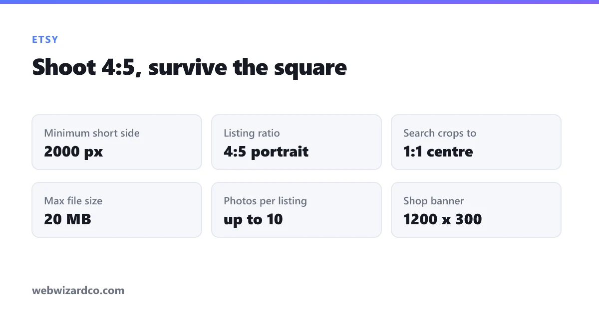
- Minimum width: 2000 pixels. Etsy asks for at least 2000px on the shortest side for listing photos. Smaller images still upload but zoom becomes soft, and zoom is where buyers decide.
- Maximum file size: 20 MB per image. Generous, but see the note on load speed below.
- Recommended aspect ratio: 4:5 (portrait) — for example 2000 × 2500. Etsy's listing page displays images in a 4:5 frame, so shooting to that ratio means nothing is cropped.
- Up to 10 photos per listing. Use them. Listings with more photos convert better, and it costs nothing.
- Shop icon: 500 × 500. Shop banner: 1200 × 300 for the standard banner, 1200 × 160 for the mini.
The square crop nobody plans for
This is the one that catches people out. Your listing page shows images at 4:5, but search results and category pages crop your first image to a square, taken from the centre.
So if you shoot a tall 4:5 photo with your product filling the frame top to bottom, the thumbnail that buyers actually see first will have the top and bottom sliced off. Long products — necklaces, wall hangings, tall candles — get decapitated in search.
The fix: compose your first photo so the product reads clearly inside a centre square, then let the 4:5 frame add breathing room above and below. A quick check is to crop a copy to 1:1 in the cropper and see whether it still sells the product. If not, reshoot or recompose.
What to actually photograph
Ten slots, and a sequence that works:
- The hero shot. Whole product, clean, well lit, square-safe. This one does most of the work.
- Scale. The single most requested thing in Etsy reviews and questions. Show the item in a hand, on a wrist, next to a common object. Buyers consistently misjudge size from photos alone.
- In use or styled. The product where it belongs — worn, on a shelf, on a table. This is where Etsy differs from Amazon: context helps rather than hurts.
- Detail. Texture, stitching, grain, clasp, finish. Proof of craft.
- Variations. Every colour or option you offer.
- Packaging. Especially for gifts — it reassures the buyer about what arrives.
Background: clean, or contextual?
Both work on Etsy, and the honest answer is that it depends on what you sell. Jewellery, prints and small goods usually benefit from a clean, uncluttered background so the item is unmistakable at thumbnail size. Home goods, clothing and anything decorative often sell better styled in a real setting.
What does not work is a distracting background — a busy kitchen counter, a patterned duvet, other products crowding the frame. At thumbnail size that reads as visual noise and buyers scroll past.
If your shooting space is not ideal, remove the background and place the product on a clean colour. Our background remover gives you a transparent PNG in your browser, which you can drop onto white or a soft neutral. Keeping a consistent background colour across a whole shop also makes your listings look deliberate when a buyer views your shop page as a grid.
For marketplaces with stricter rules, see product photo backgrounds for Amazon and Shopify — Amazon genuinely does require pure white on the main image, which Etsy does not.
File size and load speed
Etsy allows 20 MB, but that does not make it a good idea. Ten enormous images make your listing slow on a phone, and most Etsy browsing is on a phone.
A sensible target is 2000–2500px on the long edge, exported as JPG at around 80% quality, which typically lands between 300 KB and 1 MB. That is sharp under zoom and quick to load. The compressor shows the output size live so you can hit that without guessing, and the resizer handles the dimensions.
Do not go below 2000px chasing a smaller file — you lose zoom quality, which costs you more than the loading time saves.
A workflow that scales
If you list regularly, batching is what keeps this from eating your week:
- Shoot everything in one session, same spot, same light.
- Remove backgrounds in bulk where you want a clean look.
- Crop to 4:5, checking each hero shot survives a centre square crop.
- Resize to 2000px on the long edge and compress at 80%, in one batch.
Consistent lighting and framing across a shop is one of the clearest signals of a professional seller, and it comes almost entirely from shooting in one session rather than one product at a time.