You export a logo at exactly 400 pixels wide, place it in a 400-pixel-wide slot, and on your laptop it looks perfect. Open the same page on a phone and it looks slightly soft — not broken, just not crisp.
Nothing is wrong with your export. The problem is that "400 pixels" means two different things.
Two kinds of pixel
When CSS says an image is 400 pixels wide, it means 400 CSS pixels — a unit of layout, not of hardware. What the screen physically has is device pixels, and modern displays pack several of those into every CSS pixel.
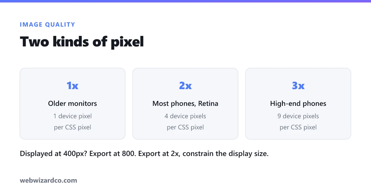
That ratio is the device pixel ratio:
- 1x — older monitors. One CSS pixel is one device pixel.
- 2x — most phones, Retina MacBooks, many modern laptops. Four device pixels per CSS pixel.
- 3x — higher-end phones. Nine device pixels per CSS pixel.
So a 400px-wide slot on a 2x phone is physically 800 device pixels across. Your 400-pixel image gets stretched to fill it, and the browser invents the difference. That invention is the softness you are seeing.
The fix: export at twice the display size
Decide how large the image appears in your layout, then export at double that:
- Displayed at 400px wide → export at 800px
- Logo displayed at 150px → export at 300px
- Full-width hero on a 1200px layout → export at 2400px
- Avatar displayed at 48px → export at 96px
Then set the display size in your HTML or CSS — width="400" with an 800-pixel file — so the browser packs those extra pixels into the same space rather than making the image bigger.
The resizer handles the export; the important part is deciding the display size first and doubling deliberately, rather than exporting whatever the original happened to be.
Why not just export everything at 3x?
Because file size grows with the square of the dimensions. Doubling width and height quadruples the pixel count. Tripling it makes the file roughly nine times larger.
A 3x image is a real cost on a mobile connection, and the visible improvement over 2x is marginal — most people cannot distinguish them at normal viewing distance. 2x is the sensible default. Reserve 3x for something genuinely critical and small, like a logo.
And do compress. A 2x image at 80% JPG quality is usually smaller than a 1x image at 100%, while looking better on every screen. There is more on that balance in compressing without losing quality.
When this does not apply
Not everything needs doubling:
- Photographs shown large are already high resolution. A 4000px camera photo displayed across a 1200px layout has pixels to spare.
- Anything for print. Print uses DPI, a different system entirely — see what DPI actually means.
- Decorative backgrounds that are blurred or low-contrast by design. Nobody is inspecting them.
- SVG logos and icons. Vectors are resolution-independent — they are drawn from maths at whatever the screen needs, so this problem does not exist. If you have the choice, use SVG for logos and icons and skip all of this.
Serving the right size to each device
Exporting at 2x means phones get a crisp image — and it also means a 1x desktop monitor downloads twice the data it can display. For a small logo that is irrelevant. For a large hero image it is wasteful.
HTML solves this with srcset, which offers the browser several files and lets it pick:
<img src="hero-800.jpg"
     srcset="hero-800.jpg 1x, hero-1600.jpg 2x"
     width="800" height="450" alt="…">
A 1x screen downloads the 800px file; a 2x phone downloads the 1600px one. Nobody fetches pixels they cannot show.
You can also offer widths rather than densities, which suits images whose display size changes with the layout:
srcset="hero-400.jpg 400w, hero-800.jpg 800w, hero-1600.jpg 1600w"
sizes="(max-width: 600px) 100vw, 800px"
That is more work, and it is genuinely optional. If you only do one thing, export at 2x and constrain the display size — that fixes the blur, which is the visible problem. srcset is the refinement for when page weight starts to matter.
Always set width and height on the tag regardless. It lets the browser reserve the right space before the image loads, which stops the page jumping around as things appear.
How to check what you are actually getting
Open your page and press F12, then hover over the image in the Elements panel. Browsers show two numbers: the intrinsic size (the file's real pixels) and the rendered size (how large it is displayed).
If intrinsic is smaller than rendered, the image is being stretched — that is your blur. If intrinsic is more than about three times rendered, you are shipping far more data than anyone can see, which is the opposite problem and just as worth fixing.
You can also check your own device's ratio by typing window.devicePixelRatio into the browser console. On a modern phone it will report 2 or 3.