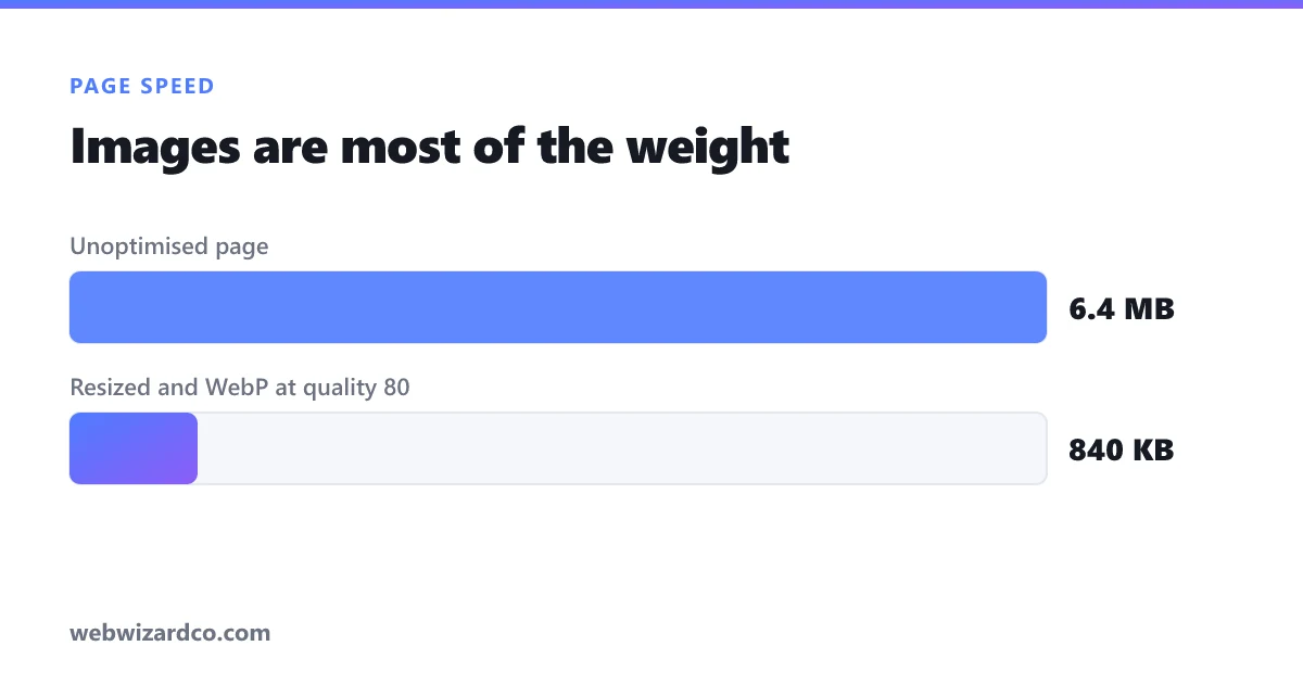
On a typical website, images account for roughly 60–70% of total page weight. If your site feels slow, images are almost certainly the reason — and it's usually the easiest problem on the whole site to fix.
Why it matters beyond "feeling fast"
Page speed affects revenue and rankings. Google uses Core Web Vitals as a ranking signal, and the metric images hurt most is Largest Contentful Paint (LCP) — usually the time until your hero image appears. Google considers LCP good at 2.5 seconds or less. A single unoptimised hero image can blow that on its own.
Meanwhile, most of the world browses on mobile data. A 4 MB page that's instant on your office wifi can take many seconds on a phone.
Step 1: Resize — the biggest win, and the one most people skip
This is where the real savings are. If an image displays at 800px wide on your site, serving a 4000px original wastes ~96% of the data — the browser downloads all of it, then throws most away.
Rule: serve images at roughly the size they display, at most 2× for retina screens. Practical maximums:
- Full-width hero: 1920px wide
- Content/blog image: 1200px
- Product thumbnail: 400–600px
- Avatar / icon: 100–200px
Use the image resizer to set these exactly.
Step 2: Choose the right format
- WebP — your default for the web. Typically 25–35% smaller than JPG at the same quality, with transparency support.
- JPG — photos where maximum compatibility matters.
- PNG — only for logos, screenshots, icons and transparency. Never for photographs.
- SVG — for logos and icons that are actually vector art; infinitely scalable and usually tiny.
More detail in our PNG vs JPG vs WebP guide.
Step 3: Compress
Export at quality 80 — the point where files shrink dramatically and the eye can't tell. Our compressor shows the resulting file size live so you can find your own balance.
Target weights per image: hero under 200 KB, content images under 100 KB, thumbnails under 30 KB. A whole page ideally lands under 1 MB.
Step 4: The free wins in your HTML
Optimising the file is only half of it. These cost nothing and help a lot:
- Lazy-load below-the-fold images:
<img loading="lazy">. The browser skips downloading them until the user scrolls near. Never lazy-load your hero image — that delays LCP. - Always set width and height on
<img>. This reserves the space so the page doesn't jump as images load (fixing Cumulative Layout Shift, another Core Web Vital). - Use responsive images (
srcset) so phones download a small version and desktops a large one. - Serve the right dimensions from the start — never resize with CSS alone.
A repeatable routine
- Resize to the display size (max 1920px for heroes).
- Export as WebP at quality 80.
- Check it's under your target weight; if not, drop quality by 5 and repeat.
- Add
loading="lazy"to everything below the fold, plus width/height on all images. - Test with PageSpeed Insights and see the difference.
Doing this across a site routinely cuts total page weight by more than half — often the single highest-impact performance change available to you.