Your thumbnail decides whether anyone watches your video. YouTube's own data is blunt about it: 90% of top-performing videos use a custom thumbnail. Here's how to make one properly.
The specs
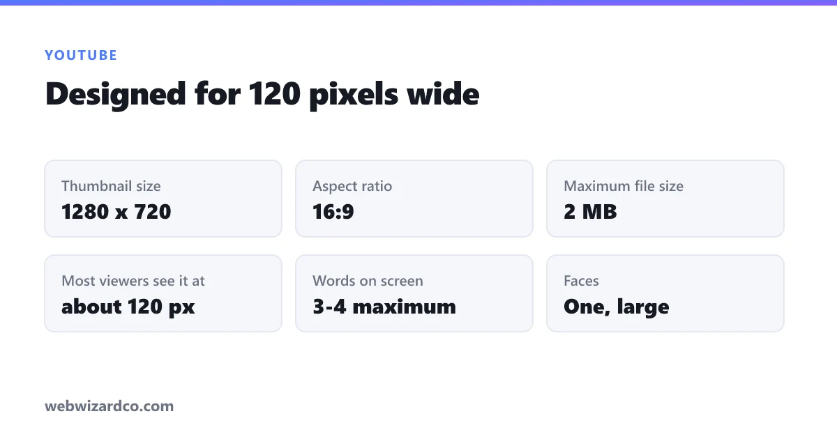
- 1280 × 720 pixels (16:9) — the standard
- Under 2 MB — YouTube rejects anything larger
- JPG or PNG — JPG for photos, PNG for text-heavy designs
- Minimum width 640px, but always use 1280 for sharpness on large screens
Our YouTube thumbnail resizer opens pre-set to 1280 × 720 so you can crop straight to size.
Design for the smallest size, not the biggest
This is the mistake nearly everyone makes. You design on a large monitor where your thumbnail is 400px wide — but most viewers see it at roughly 120px wide on a phone. At that size:
- Small text is completely unreadable
- Busy backgrounds turn to mush
- Fine detail disappears
Test: shrink your thumbnail to 120px wide and look at it. If you can't tell what it says in a second, it fails.
The rules that actually move click-through rate
1. Three or four words maximum
The title is already next to the thumbnail — don't repeat it. Use the thumbnail text to add a hook the title doesn't: a number, a result, a contradiction. Big, bold, high-contrast type.
2. Faces with clear emotion
Humans are wired to look at faces. A face with a distinct expression — surprise, concentration, delight — reliably outperforms an object shot. Crop close; a face that fills a third of the frame reads at 120px, a full-body shot doesn't.
3. Contrast, contrast, contrast
YouTube's interface is white or black. Your thumbnail must not blend into either. Bright, saturated colours with strong separation between subject and background stand out in the feed. Cutting your subject out and placing them on a bold flat colour is the single most effective trick here — use the background remover, then drop the cut-out onto a colour that clashes with your subject's clothing.
4. One focal point
A thumbnail is seen for a fraction of a second. One subject, one message. Collages of four screenshots communicate nothing at thumbnail size.
5. Keep the bottom-right corner clear
The video duration badge sits there. Anything important in that corner gets covered.
A workflow without Photoshop
- Take or pick your image — a clear photo of you, or of the result you're promising.
- Cut out the subject with the background remover so you can control the background completely.
- Compose in any free editor: bold background colour, your cut-out subject, three words of huge text with a contrasting outline.
- Resize to 1280 × 720 with the resizer.
- Compress under 2 MB with the compressor if needed.
Consistency beats cleverness
Channels that grow fast usually have a recognisable thumbnail style — same font, same colour palette, same crop treatment. A subscriber scrolling the feed should recognise your video as yours before reading the title. Pick a formula and repeat it.
Test, don't guess
YouTube Studio shows click-through rate per video. Anything above 4–5% is respectable; 10%+ is strong. If a video has good watch time but low CTR, the content is fine and the thumbnail is the problem — remake it. You can change a thumbnail at any time, including on old videos, and it's one of the few genuinely free wins available on the platform.