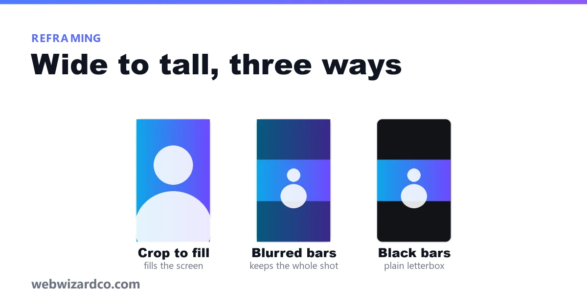
A 16:9 frame is 1.78 times wider than it is tall. A 9:16 frame is the reverse. Fitting one into the other by cropping means keeping a vertical strip that is just 31% of the original width — you are discarding more than two thirds of the picture. The question is never whether you lose something. It is which thing you can afford to lose.
Option 1: crop to fill
Keep a vertical slice and throw away the sides. The result fills the screen edge to edge, looks native, and is what most high-performing reels do.
Use it when there is one subject and they sit near the centre: a single speaker, a product on a table, a phone screen recording of a vertical app.
Avoid it when two people are talking at opposite edges of frame, when there is on-screen text or a lower third that runs the full width, or when the composition is the point — a wide landscape cropped to a strip is just a worse photo.
The useful trick is that the crop does not have to be centred. In an interview where your subject sits on the left of frame, slide the crop left and they are perfectly composed. Zooming in slightly before cropping also lets you tighten onto a face, at the cost of some sharpness.
Option 2: blurred bars
Keep the entire 16:9 shot, shrink it to fit the width, and fill the space above and below with a blown-up, blurred, darkened copy of the same frame.
Use it when you cannot afford to lose anything horizontally: two-person interviews, screen recordings of desktop software, anything with text across the frame, slides, gameplay, sport.
It has two underrated advantages. The bars give you somewhere to put captions that is not on top of the picture, and the blurred fill reads as a deliberate style rather than an accident, which plain black does not.
The drawback is that your actual content occupies a band across the middle rather than the whole screen, so faces end up smaller. On a phone that is less of a problem than it sounds — but if your subject is already small in a wide shot, crop instead.
Option 3: plain black bars
The same as above without the blur. Honest, predictable, and occasionally the right call — particularly when the blurred version looks busy, or when you want it to be obvious that this is an excerpt from a longer landscape video.
It is the weakest choice aesthetically, and some platforms generate thumbnails that handle a flat black band poorly. Use it deliberately, not by default.
A quick way to decide
- One person, centred, nothing important at the edges → crop
- Two people, or text across the frame, or a screen recording → blurred bars
- Subject off to one side → crop, with the frame moved towards them
- Wide landscape where the composition is the content → reconsider whether it should be vertical at all
Check the bottom of the frame before you export
Whichever you choose, remember that the platform's interface covers roughly the bottom fifth of a vertical video. A crop that perfectly composes your subject in the centre is fine; one that places their chin at 85% down the frame will have the share button across it. The reel maker shows the safe area over the preview so you can see this before it matters, and lets you drag the frame to reposition the crop while watching the result.
For the exact dimensions to export at, see reels, shorts and TikTok sizes.